2011-2012
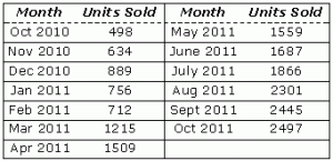
For the second year in a row, one toy looks to dominate the market once again: My First Cliff Diving Kit. It is all the rage, because it comes with everything you need to be an effective cliff diver: swim trunks, neck brace, legal documents for naming next of kin, and very detailed one-paragraph instruction sheet about how to cliff dive safely. Below, you’ll find a chart representing the sales figures for the each month it has been available. Use that chart to answer the questions that follow.

(a) Assuming that you can draw a continuous graph connecting all the data points, write the equation of line L, the tangent line to the sales graph when x = May 2011.
(b) What is the average rate of sales between November 2010 and September 2011?
(c) Draw a rough sketch of the graph representing the rate of sales between Oct 2010 and Oct 2011.
Solution:
(a) To write the equation of a line, you need two things: a point and a slope. You’ll need to assign some x-values, because the independent variables are months and not numbers. Assign October 2010 an x-value of 0 and October 2011 an x-value of 12. This produces the graph below.

Therefore, the point representing May 2011 is the coordinate (7,1559). To estimate the tangent there, calculate the slope between that point and the point immediately preceding it, (6,1509).
![]()
Therefore, a good approximation for the tangent line would be y – 1559 = 50(x – 7), according to point-slope form. You could also approximate the derivative by using the point immediately after May 2011, and you’ll get a slope of 128 rather than 50. That seems like a huge difference, but since you don’t have any intermediate points, who’s to know which is the better approximation?
(b) Calculate the average rate of change using the slope of the secant line connecting the points: (1,634) and (11,2445).
![]()
Therefore, the kits are selling better overall on the entire time period when compared with how they were selling in May 2011, no matter which derivative approximation from part (a) you use.
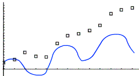
(c) Use the same process as part (a) to approximate each derivative, and you’ll get something that looks roughly like this the graph below.

Notice that the graph dips below the x-axis on roughly the interval (2,4) because the data seems to be decreasing there. the faster the data points increase, the greater the height of the blue derivative graph.
The video may take a few seconds to load.Having trouble Viewing Video content? Some browsers do not support this version – Try a different browser.


